It’s fitting that the last of my greatest hits series should focus on what I consider to be my most important work—my periodic, sometimes quixotic, attempts to help make the world a better place.
Advertisements that Matter
Self-Aggrandizement Time: It’s always been a principal of mine that advertising should be used for public good as well as commercial enterprise. Through the years, I’ve endeavored to use my creative talents as constructively as possible, adopting the physician’s admonition “Do No Harm!” through my advertising as well as the concomitant responsibility, as a decent human being, to “Do Some Good!”
To that end I found myself taking on challenges, usually through pro bono relationships, that would further the public well-being, as I saw it. My first major effort involved Road To Responsibility (RTR), an organization serving developmentally disabled adults. As I normally do, the first focus of my efforts was to create a brand for RTR; in this case, one that was built on a simple positive expression of the organization’s—and its clients’!—overriding reality. “We’re Not Perfect, We’re Just Great!” was the resulting tagline/theme that arose, pictured as you can see on a button.

Our first effort, after developing the theme “We’re Not Perfect, We’re Just Great!” was to develop a capabilities brochure that RTR could use to search out employment opportunities for its clients.
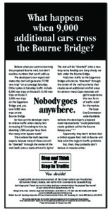
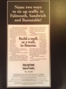
The Ad Campaign That Prevented The Malling of Cape Cod: They called their mall Canalside Commons and it was a huge one—mega-sized—proposed for the off-Cape side of Bourne, Massachusetts.
 At the time, I was involved in pro bono projects for the Conservation Law Foundation, including a campaign meant to force Vermont to start cleaning up Lake Champlain’s toxic runoff pollution (see elsewhere in this post). When I was called in to develop an advertising campaign to help prevent Canalside Commons’s final approval, it was not yet understood by the public what was really at stake; that the mall would turn a bad traffic situation on the lower Cape into permanent gridlock.
 If you can believe it, the mall’s designers had planned to redirect all Cape-bound traffic through the mall before it passed over the Bourne Bridge. Even more incredible was the fact the mall had already received all approvals it would need from every state agency and Bourne’s municipal boards.

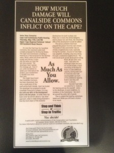
The only required approval not yet acquired was from the Cape Cod Regional Commission. By the time the last ad ran in the Cape Cod Times (see below “Don’t Let Cape Cod Get Malled…”) we had awoken the local citizenry and caused enough of them to protest the mall at the Commission’s hearing to prevent Canalside Commons from getting its last critical approval.
 The first ads in the series were designed to elevate public awareness of the severity of what was coming down the road, so to speak, should the mall get approved and eventually built. You’ll notice each ad uses humor in its own way to blunt the harshness and bleakness of the campaign’s dismal prophetic message.
The last ad, seen on the right,  was designed to get out the troops and marshall whatever forces we had to show up at the quarterly hearing of the Cape Cod Regional Commission. I was told there was an angry and vocal crowd (picture angry townspeople encircling Frankenstein’s castle) waiting to tell the commissioners exactly what they thought about the proposed mall.
While In Our Back Pocket…A Campaign To Laugh Them Off The Cape
 One of the reasons why Canalside Commons had been granted all their approvals was the questionable and highly disputable report their experts released examining the project’s environmental impacts. Or lack of impacts, more accurately, as I explained in a campaign that never saw the light of day.
Still, its use of humor makes it one advertising campaign I particularly enjoy. Here then, for your enjoyment, is that second campaign.


The Campaign To Save Lake Champlain: Here again a lack of public awareness was contributing to a growing environmental disaster: the pollution of Lake Champlain, one of Vermont’s most valued resources. Long thought to be  pristine and beautiful, by the early 1990’s Lake Champlain had developed a pollution problem caused by runoff from malls, parking lots and construction sites that was creating a toxic tide in the lake that, at its worst, had killed a couple of dogs, and would periodically necessitate banning all swimming or human activity in lake waters.
  These two ads, as well as one or two others, quickly galvanized public attention and legislative response to the problem, eventually resulting in the appointment of a Lakekeeper.
Fighting Against the United States Government’s Use of Torture: Hard to believe now, but our country had taken a turn toward the dark side after 9/11 and had consciously determined we would use torture against our enemies.  First, of course, we changed the definition of torture to suit our purposes, and even though we had executed Japanese soldiers for waterboarding U.S. soldiers, the powers that be in the George W. Bush administration changed the definition of torture to exclude any extreme interrogation methods used by U.S. interrogators after 9/11, including waterboarding. To say the least, it was a low water mark for an administration that exhibited a shocking propensity for lawless action and deceitful behavior.
I was working at the time as Interim Communications Director for the Unitarian Universalist Service Committee, a human rights organization that had originated back in the 1940’s to rescue European children from the Nazi holocaust.
The ad above appeared in the New York Times to announce the formation of UUSC’s S.T.O.P. Program (Stop Torture Permanently).  The ad to the right never ran, but I had written it with the express idea of running it weekly in the Washington Post to accomplish two goals: 1.) to weaken or undermine torture at its primary level, in the mind of the torturer himself; and 2.) to help combat the Big Lie being repeatedly told by our government (including our president) with the blind acquiescence of the media itself. By running the ad weekly we would be speaking truth in the face of the administration’s steady torrent of lies. I had also planned to run weekly ads speaking “To You Who Authorize Acts of Torture,” with the idea that self-revulsion and a crisis of conscience for the use of torture had to be running pretty high-up in the Bush administration. Unfortunately, I was unable to convince my UUSC supervisors of the advisability of such a campaign.
And Four For The Road:
Four more, just for the fun of it.
 One, a poster celebrating The Human Right To Water; the second my bumper sticker response to the Republicans in congress continuously, aggravatingly, puerilely attempting to starve the government rather than see it perform any of its socially responsible duties for those Americans needing assistance or living below or close to the poverty line. (please excuse the inclusion of my RTR branding button; I’m not skilled enough to cut it out from the pdf.)

And next: if you have the interest, check out the Facebook page for ORANGE SHIELD, my anti-bullying program, targeted to middle and high school student populations. OPPORTUNITY ALERT: ORANGE SHIELD is in search of a national distribution partner or sponsor. Note: banner below, filled with student signatures, was from the ORANGE SHIELD pilot program at Randolph High School.

And lastly, one of a series of 30 posters meant to combat indifference to, or outright denial of, Global Warming. (Click here to see the entire series) All of the posters, as well as much of the work shown above, was done in collaboration with Bill Dahlgren, a fabulous art director as well as a good friend of long standing. Again, a sense of humor prevented this campaign from becoming a bitter pill to swallow.

To see the entire “Tales From An Overheated Planet” series, click here. (Well worth your while, I assure you!) To view my #1 Greatest Hits advertisement, click here. To view #2 in the series, click here. To view #3 (which required reposting, for some strange reason),click here. To view #4, click here. To view #5, click here. To view #6, featuring my favorite billboards, click here. To view #7, click here. To view #8, featuring my favorite campaign that never ran, click here. To view #9, featuring some of my favorite W.B. Mason TV commercials, click here. To read my essay about creating the “Who But W.B. Mason!,” brand click here. Or, if you’re interested in seeing other examples of my mind at work, visit my web site. To speak with me about building or creating your company’s brand, contact me at 857-389-2158 or at [email protected].


