Category Archives: Advertising Icons

Paul Steven Stone’s Greatest Hits, #9 in a series

W.B. Mason Rides The Airwaves Once Again!

In December 1996, the W.B. Mason company assembled all of its trucks and most of its employees— plus its hopes and vision for the future—on the campus of Stonehill College in Easton, MA. We were there with a film crew to take my branding effort for W.B. Mason to its next logical phase—the airing of television commercials! This was a milestone I had long envisioned but, more to the point, had long and deeply feared.  For how was I to take a brand I had fashioned for letterhead, trucks, newspapers and magazines and convey that same sense of circus-like fun and entertainment in a 30 second TV commercial? The most obvious answer when looking at the colorful illustrations we had used in our advertising was to create animated TV commercials. But the cost of animation immediately ruled out that solution. So what could we do…?

#1: “The Boston Invasion” (where it all began)

The background on this, our first real TV commercial, is quite interesting; it shows how one’s journey is never as straight as it appears in hindsight. I had previously created a low-cost cable TV spot for W.B. Mason in which we advertised the opening of our Hyannis furniture showroom. When initially discussing the cost of creating the Hyannis commercial I had promised my client we would amortize its cost by re-using it when we were ready to promote our showroom opening in Boston.  So, when Boston was about to open, I met with the Mason partners, intent on keeping my promise, and found, to my surprise they were not as agreeable to my ideas as they usually were. Clearly, the four partners had little love for the TV spot we ran on the Cape, or for the idea of reusing it in Boston. One of the partners argued with my music choice while another criticized my script. Up until that meeting, my clients had never questioned my lead on anything.

Back then, of course, I held such power with the Mason partners that I eventually got them to agree to most of what I had planned. But that night I awoke at 3 AM with the startling realization that I was wrong and my clients were right. Being honest with myself, I had to admit our TV commercial was bland, nothing that complemented or added to our already successful brand identity. As I later told the partners, this was the first time they had taken the lead, instead of me, in building and protecting their brand. Once I came to that realization, I began to envision the exact kind of TV concept I knew would serve as a companion and enhancement to the Mason’s brand. It was titled  “The Boston Invasion” and its driving spirit was equal parts, parody, farce and comic earnestness. Going forward I would use this blend of broad, almost cornball humor to present the Mason brand on TV. For our first outing, we parodied a major military operation, something akin to “Thirty Seconds Over Tokyo,” only instead of B-52’s on a mission to bomb Tokyo, we would send our trucks in convoy to rescue Boston. With tongue firmly in cheek, that was the beginning of a series of black and white TV commercials, some with W.B. Mason and some without, that established our brand presence across TV market after TV market.

It’s interesting to note the Mason partners liked the Boston Invasion so much we ended up introducing it on the Super Bowl that year.

Mason was always one to back up its passions with money.

Here are five other TV spots that followed and built upon the resolute archness voiced by our Cronkite-like announcer and displayed by our heroes. In those ads featuring W.B. Mason, Adam Twiss played the role of W.B. to perfection; his archness and melodramatic urgency giving W.B. a depth and vibrancy I could never have imagined when writing the scripts. It’s only fair to mention, all of my W.B. Mason TV commercials were written by me and directed by Bob Noll of Boston Productions, now BPI.

#2:” The Amazing Delivery” (Highlighting our amazing commitment to service)

#3: “LPAD Cold Call” (From The Files of W.B. Mason’s Low Price Assurance Detectives)

The LPAD concept came about after Leo Meehan, CEO and President of Mason, called me on his way back from a New York City business trip where he accompanied Mason sales people on cold calls. “Something very interesting happens each time people in New York see two people enter an office wearing dark business suits,” he told me over the phone. “There’s a moment when they’re trying to figure out whether we’re from the FBI or the Immigration Service; and in that moment we have their undivided attention. I don’t know what you can do with that, but there must be something.” Out of that phone call came the Low Price Assurance Detectives who archly enter an office and declare “We’re here to save you money!” In case you’re curious, I’m proud to say I still have my LPAD badge!

#4: “A Farewell To Arms” (Helping to Introduce Same-Day Delivery Service)

#5: “The Couch Detective” (Thereby proving my crying need for therapy)

#6: “The Lineup”

One of a series of “BuyRight” themed TV Commercials focused on W.B. Mason’s BuyRight program, which features the quality name brands our customers prefer rather than the proprietary (and inferior) branded products often sold by our competitors.

I recently revisited these and others of my early W.B. Mason TV commercials. To date, I’ve created between 80 and 90 spots for Mason, not all of them parodies or black and white. But all, I believe, with a distinct sense of my comic spirit which deftly permeates not only the commercials, but the entire “Who But!” brand I first crafted back in 1986.

#7: Oh, what the hell, here’s one more, just for laughs!

These commercials were always meant for people like you to enjoy. So, please, make me happy, go ahead and enjoy!

To view my #1 Greatest Hits advertisement, click here. To view #2 in the series, click here. To view #3 (which required reposting, for some strange reason),click here. To view #4, click here. To view #5, click here.To view #6, featuring my favorite billboards, click here. To view #7, click here.  To read my essay about creating the “Who But W.B. Mason!,” brand click here.  Or, if you’re interested in seeing other examples of my mind at work, visit my web site. To speak with me about building or creating your company’s brand, contact me at 857-389-2158 or at PaulStevenStone@gmail.com.

Paul Steven Stone’s Greatest Hits, #8 in a series

The campaign that never was…

For any of you who read my article on the creation of the W.B. Mason brand, “Who But: The Birth of an Iconic New England Brand,” you’re already familiar with the dysfunctional and creatively stifling attitude that prevailed at Arnold Advertising back in the mid-80’s.

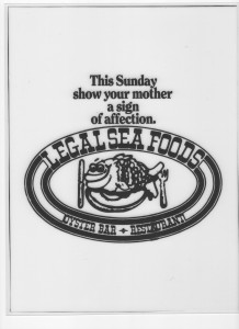
This would have been the campaign's introductory ad, I would guess, because of its simplicity and boldness. It was pretty easy to identify the star of the show, preparing you for the others in the series.

This would have been the campaign’s introductory ad. It was pretty easy to identify the star of the show, preparing you for the other ads in the series.

If you recall, the sudden loss of two of its largest accounts, Fayva Shoes and John Hancock Insurance, had tossed Arnold into grave soul-searching and second-guessing of its creative capabilities, so much so that two creative professionals (a copywriter and an art director) were brought in to improve the creative level of the agency’s output.

And so it was that these two creative supervisors would hijack almost all creative presentations before they left the agency; the idea being they could almost always improve the creative product, usually by redoing it entirely. Which eventually resulted in giant bottlenecks in the agency’s creative workflow.

Legal's 5The campaign layouts on this page were part of a new business campaign crafted by myself and art director Rich Kerstein, my Arnold creative partner, to help reel in Legal’s Seafoods (pun definitely intended).  I will not describe the campaign’s rationale or strategic positioning. Suffice it to say I wouldn’t present these layouts if they couldn’t speak for themselves. But be sure to take note of the brand’s elitist attitude.

You’ll notice, once the introductory ad (“Sea Boston”) established the “game”, it was then merely a question of following up with ads whose headlines gracefully and humorously entered into a dance with Legal’s famous heavy-lips logo.

Legal's 3Like all other creative presentations, this one was hijacked and held up inside the agency by our creative supervisors, and held up for months.

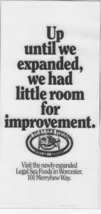
This is one of my most favorite headlines EVER. There's a logic loop that never gets completed and leaves one wondering if the headline makes any sense whatsoever. Confidentially, it doesn't.

This is one of my most favorite headlines EVER. There’s a logic loop that never gets completed and leaves one wondering if the headline makes any sense whatsoever. Confidentially, it doesn’t.

Ultimately, in one of his last major executive actions before retiring, agency C.E.O., Arnold Rosoff—a man dearly beloved by all who knew him—ordered the campaign released from its purgatory and presented to Legal Seafoods, which signed up for the campaign and a new agency relationship almost immediately upon viewing the campaign. It was a relationship fated to last a mere few months.

That's supposed to be a Legal's Seafood matchbook.

That’s supposed to be a Legal’s Seafood matchbook at the bottom of the ad. There’s a dotted line around the matchbook, indicating you can cut it out and paste it onto any regular matchbook cover to impress your friends.

It should be noted Legal’s was a notoriously difficult client. One that never truly felt they needed advertising to grow their business. I knew this from having worked on their advertising at another Boston ad agency. Their success grew out of a highly popular, and slightly idiosyncratic, business model whereby meals were served to parties one-at-a-time, food being delivered to the table as soon as it was fully prepared and before it had time to cool down. That piecemeal presentation of individual orders coupled with Legal’s total emphasis on serving only the freshest seafood, made for a unique and unforgettable dining experience.

Legal's 7I had already left Arnold by the time the agency had captured and lost the Legal’s account, so I’m not privy to why the account quickly parted ways with the agency.

As a backdrop to some of the layouts presented here, you need to understand that, back in the 1980’s, Legal’s had not yet grown beyond its Boston footprint, so some of the ad headlines shown  on this page made more sense back then than they would today.

In any case,  peppered throughout this blog entry you’ll find a partial look at the campaign that won the Legal Seafoods business back in 1988, but never made it to the newspapers and billboards for which it was intended.

Legal's 6And now, after all these years, it’s here for you to enjoy!

No thanks necessary.

———————————

On a different matter, if you haven’t received notice of #7 of My Greatest Hits, my HAZMAT ad for the Conservation Law Foundation, click here to see what you missed.

To view my #1 Greatest Hits advertisement, click here. To

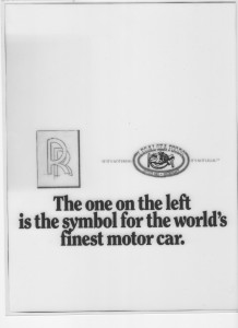
Remember, this was a layout done before art director's had access to, and unfettered use of, the internet and online stock photo imagery. That Rolls Royce logo would have looked a lot better in a layout done today, I can assure you.

Remember, this was a layout done before art directors had access to, and unfettered use of, the internet and online stock photos. That Rolls Royce logo would have looked a lot better in a layout done today, I can assure you.

view #2, click here. To view #3, click here. To view #4, click here. To view #5, click here.

To view #6, featuring my favorite billboards, click here. To read my essay about creating the “Who But W.B. Mason!,” brand click here.  Or, if you’re interested in seeing other examples of my mind at work, visit my web site.. To speak with me about building or creating your company’s brand, contact me at 857-389-2158 or at PaulStevenStone@gmail.com.


Paul Steven Stone’s Greatest Hits, #6 in a series

There’s nothing more fun than creating than a billboard!

As someone who loves to conceptualize billboards, to come up with an idea that will stop a million drivers in their mental tracks, I must also admit to an ornery contrarian opinion that billboards should be outlawed, that billboard advertising is a subtle form of environmental pollution that goes mostly unnoticed, probably because of its historical roots. And because most billboards today are excruciatingly dull. More worthy to be called Bill-BOREDS than billboards.

BBFleet billboard

Today, hardly anyone remembers Fleet National Bank, but not too long ago they were an aggressive player on the local bank scene. The billboard above was conceived by Rich Kerstein and myself back when we were a creative team at Arnold & Co.

See Below For More Mind-Massaging Billboards!

Ask yourself, what gives advertisers the right to intrude into the minds of the driving public just because they pay for the privilege? With advertising on TV and radio, and in publications, people understand the rules of the game and willingly endure ads for the sake of the programming. But nobody is given a choice to look at a billboard or close their eyes on a public thoroughfare.

But, hey, as long as they keep allowing billboards, I’ll keep on having my creative fun!

Anyway, the point here today is not to debate or deride billboards, but to share some of my favorite billboard creations. Such as…

BBTaymor's

This is one of my favorite billboards, though also one of my most embarrassing because we originally showed the logo so small it was difficult to read at 55 miles per hour. Once we sent the billboard artists back up to make the correction, everyone could see the sponsor was Taymor’s, a once proud chain of local shoe stores, who were itching to get their hands on your feet.

Next, a billboard that attracted national attention because Michael Dukakis was running for president when we first previewed the billboard on the Southeast Expressway. Back then, the line “Food for A King” sounded like a hackneyed cliche up until the name “Dukakis” reminded people of a different type of king—Ed King, former governor of Massachusetts who was notorious for treating his state trooper escorts to lobster dinners. Dukakis, who not only preceded King as governor, but also followed him in that office, was notoriously tight-fisted and non-royal in his use of the trappings of power.

BBNew Gazelle


My next three are W.B. Mason billboards. Over the years I must have created a dozen or more Mason billboards, most of which featured W.B. in some sort of epic or heroic situation. The one exception is the one below with its star attraction being the word/phrase I coined when introducing W.B. Mason’s new same-day delivery service, “gotta-hafta-geddit.” (to see the TV Commercial from the “Gotta-hafta-geddit” campaign, go to:

http://www.wbmason.com/AboutUs/commercials.html. (Look for “gotta hafta gedit”).

Same-Day Delivery

No other options exist when you Gotta-hafta-geddit today!

No other options exists when you Gotta-hafta-geddit today!


Using Our Competitor’s Size Against Them

BBHercules billboard

We loved to use extensions to create visual tension and energy. Note that W.B. Hercules stands taller than the billboard, and that his chains are bursting apart, seemingly in mid-air.


Staking Claim To Our Turf (as seen on the Expressway leading into Boston)

BBsoldier billboard

Our most controversial billboard, this one had the bad luck to go up on the Southeast Expressway around the same time America sent troops into Kosovo and the Columbine shootings rocked the country. Irate motorists called to complain about the giant bazooka on the W.B. Mason billboard even though it was clearly (to us) a magic marker.

NOTE:  none of the above billboards, or any that I created during my career, ever appeared on those newfound and ubiquitous electronic billboards. In my opinion, those digital billboards with their rapidly changing messages—along with the vertical blinds billboard that changes its message every 20 or 30 seconds—have very little value compared to the original one-board/one-message billboard. With all the billboards shown above, I owned the mental space surrounding the billboard. My message was never interrupted by someone else’s message. My billboards had the time they needed to craft a relationship with each and every driver that rode by. With electronic billboards you never finish absorbing one message before the next is wiping out any residual impression or reaction. When you saw one of my billboards from far away you began to react to it even before you were certain of what it was saying. If you couldn’t quite read it, or see the image, your curiosity was engaged and sustained as you approached. And your initial curiosity was given time to settle into an understanding, which then had time to mushroom into additional thoughts and reactions. Also, by the clever use of billboard extensions and a billboard’s three-dimensionality (see the Fleet board above) we had a tool by which we could enliven the usual billboard experience, having our message grow beyond the ordinary limits and physical restraints of a billboard.

To view my #1 Greatest Hits advertisement, click here. To view #2, click here. To view #3, click here. To view #4, click here. To view #5, click here.To read my story about creating “Who But W.B. Mason!,” click here.  Or, if you’re interested in seeing other examples of my mind at work, visit my web site.. To speak with me about building or creating your company’s brand, contact me at 857-389-2158 or at PaulStevenStone@gmail.com.

Paul Steven Stone’s Greatest Hits, #5 in a series

“That’s a lovely light,” Timothy Leary said, smiling.

Wolferscopy

Fifth amongst my greatest hits, the Wolfers Lighting “Surreal Context” campaign. A series of ads celebrating the lost years of the sixties, with all its surreal imaging, M.C. Escher perspectives and Kafkaesque mind twists. Offering the elegant thought, “Anything goes when it comes to creating lighting environments.”

The above ad was the vanguard of the campaign, its graffiti backdrop serving as the ideal springboard for both the ad and the campaign that followed. Debra Elliott, the campaign’s art director, created the image of the lamplit graffiti wall and, almost immediately, we were off and running. Deb and I collaborated on all ads in the series.

WolfersAd_Girl_Forest copy

It’s important to note all the heavy lifting is done by the visuals in each ad. Our headline had to be simple and dry, serving as contrast to the wild whimsy of the visuals. Once you see how the series unfolded you can easily begin imagining any number of illogical environments that could be enlivened by beautiful lighting. Purchased of course at the magical epicenter of all this fabulous advertising whimsy, Wolfers Lighting.

WolfersAD_Sandcastle copy

Now, of course, it was time to talk about surreal lighting applications.

WolfersAd_Gymnist

To view my #1 Greatest Hits advertisement, click here. To view my #2 Greatest Hits advertisement, click here. To view my #3 Greatest Hits advertisement, click here. To view my #4 Greatest Hits advertisement click here. To read my story about creating “Who But W.B. Mason!,” click here.  Or, if you’re interested in seeing other examples of my mind at work, visit my web site.. To speak with me about building or creating your company’s brand, contact me at 857-389-2158 or at PaulStevenStone@gmail.com.
Paul Steven Stone’s Greatest Hits, #4 in a series

Do do that Doo Wop that you do so well!

I always say, “What’s the purpose of an ill-spent youth if you can’t exploit it?” Which is exactly what I set out to do with my Doo Wop W.B. Mason commercial.

This commercial is one of my personal favorites. It reflects how the best work is often the most fun. I loved writing and producing “Doo Wop.” It was a nugget of my youth come to life on a commercial stage.  I was extremely fortunate, especially in my earliest W.B. years that our basic strategy for developing our brand was to produce TV commercials and print ads that created affection for W.B. out in the marketplace—with potential customers or not, it didn’t matter. Selling merchandise or not, that didn’t matter either. What mattered was winning the public’s affection, which could help to explain how W.B.’s brand seemed to go viral almost as soon as we hit the public airwaves.

To view my #1 Greatest Hits advertisement, click here. To view my #2 Greatest Hits advertisement, click here.To read my story about creating “Who But W.B. Mason!, click here.  Or, if you’re interested, you can visit my web site to see many other examples of my work. To speak with me about building or creating your company’s brand, contact me at 857-389-2158 or at PaulStevenStone@gmail.com.

(Yikes I just noticed that #3 in the series appears to be missing from my blog postings)