The campaign that never was…
For any of you who read my article on the creation of the W.B. Mason brand, “Who But: The Birth of an Iconic New England Brand,” you’re already familiar with the dysfunctional and creatively stifling attitude that prevailed at Arnold Advertising back in the mid-80’s.

This would have been the campaign’s introductory ad. It was pretty easy to identify the star of the show, preparing you for the other ads in the series.
If you recall, the sudden loss of two of its largest accounts, Fayva Shoes and John Hancock Insurance, had tossed Arnold into grave soul-searching and second-guessing of its creative capabilities, so much so that two creative professionals (a copywriter and an art director) were brought in to improve the creative level of the agency’s output.
And so it was that these two creative supervisors would hijack almost all creative presentations before they left the agency; the idea being they could almost always improve the creative product, usually by redoing it entirely. Which eventually resulted in giant bottlenecks in the agency’s creative workflow.
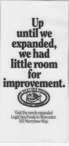
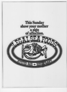
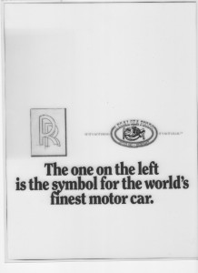
 The campaign layouts on this page were part of a new business campaign crafted by myself and art director Rich Kerstein, my Arnold creative partner, to help reel in Legal’s Seafoods (pun definitely intended). I will not describe the campaign’s rationale or strategic positioning. Suffice it to say I wouldn’t present these layouts if they couldn’t speak for themselves. But be sure to take note of the brand’s elitist attitude.
You’ll notice, once the introductory ad (“Sea Boston”) established the “game”, it was then merely a question of following up with ads whose headlines gracefully and humorously entered into a dance with Legal’s famous heavy-lips logo.
 Like all other creative presentations, this one was hijacked and held up inside the agency by our creative supervisors, and held up for months.

This is one of my most favorite headlines EVER. There’s a logic loop that never gets completed and leaves one wondering if the headline makes any sense whatsoever. Confidentially, it doesn’t.
Ultimately, in one of his last major executive actions before retiring, agency C.E.O., Arnold Rosoff—a man dearly beloved by all who knew him—ordered the campaign released from its purgatory and presented to Legal Seafoods, which signed up for the campaign and a new agency relationship almost immediately upon viewing the campaign. It was a relationship fated to last a mere few months.

That’s supposed to be a Legal’s Seafood matchbook at the bottom of the ad. There’s a dotted line around the matchbook, indicating you can cut it out and paste it onto any regular matchbook cover to impress your friends.
It should be noted Legal’s was a notoriously difficult client. One that never truly felt they needed advertising to grow their business. I knew this from having worked on their advertising at another Boston ad agency. Their success grew out of a highly popular, and slightly idiosyncratic, business model whereby meals were served to parties one-at-a-time, food being delivered to the table as soon as it was fully prepared and before it had time to cool down. That piecemeal presentation of individual orders coupled with Legal’s total emphasis on serving only the freshest seafood, made for a unique and unforgettable dining experience.
 I had already left Arnold by the time the agency had captured and lost the Legal’s account, so I’m not privy to why the account quickly parted ways with the agency.
As a backdrop to some of the layouts presented here, you need to understand that, back in the 1980’s, Legal’s had not yet grown beyond its Boston footprint, so some of the ad headlines shown on this page made more sense back then than they would today.
In any case, peppered throughout this blog entry you’ll find a partial look at the campaign that won the Legal Seafoods business back in 1988, but never made it to the newspapers and billboards for which it was intended.
 And now, after all these years, it’s here for you to enjoy!
No thanks necessary.
———————————
On a different matter, if you haven’t received notice of #7 of My Greatest Hits, my HAZMAT ad for the Conservation Law Foundation, click here to see what you missed.
To view my #1 Greatest Hits advertisement, click here. To

Remember, this was a layout done before art directors had access to, and unfettered use of, the internet and online stock photos. That Rolls Royce logo would have looked a lot better in a layout done today, I can assure you.
view #2, click here. To view #3, click here. To view #4, click here. To view #5, click here.
To view #6, featuring my favorite billboards, click here. To read my essay about creating the “Who But W.B. Mason!,” brand click here. Or, if you’re interested in seeing other examples of my mind at work, visit my web site.. To speak with me about building or creating your company’s brand, contact me at 857-389-2158 or at PaulStevenStone@gmail.com.


